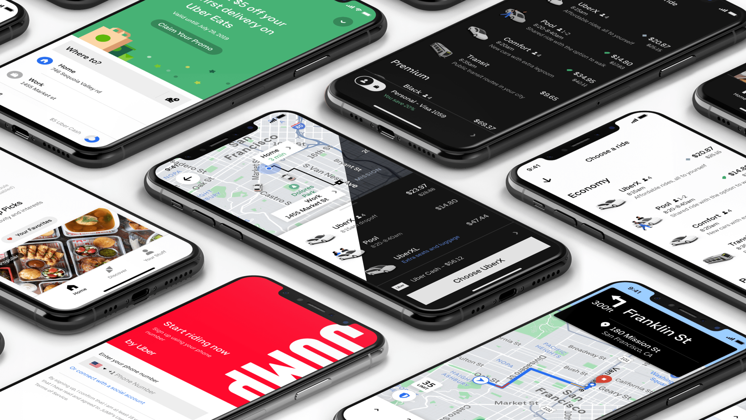
Base Design System at Uber
Base is Uber’s design system for both Mobile and Web. It is the culmination of years of work; from unifying a centralized Design System team, to moving all platforms (web, iOS, and Android) to the same foundational elements. Base was the first DSL at Uber that made Accessibility and Inclusion a first class citizen. Furthermore, the first one to have a robust and scalable foundation that makes possible design at scale.
living documentation
Having all the design components in Figma allowed us to centralize not only the UI Kit, but also documentation, and implementation statuses on the same Figma Library. This made it seamless to communicate with Design and Engineering about changes, answer questions, and iterate faster.

Accessibility and Inclusion

RTL Languages
As part of our Inclusion push, I led this efforts with engineers to have our icons, that represented movement or direction, switch automatically in RTL languages like Arabic and Hebrew.
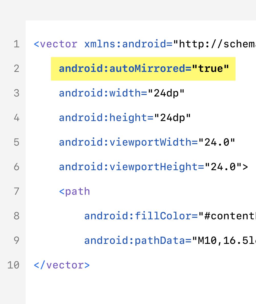
SVG Icons
We developed an internal framework to display SVG icons on iOS too. This allowed us to mirror icons for RTL languages, and be more efficient with our assets in all mobile apps.

Dynamic Text and Theming
Every component we built was tested against different text sizes, languages, and color contrast for light and dark modes.
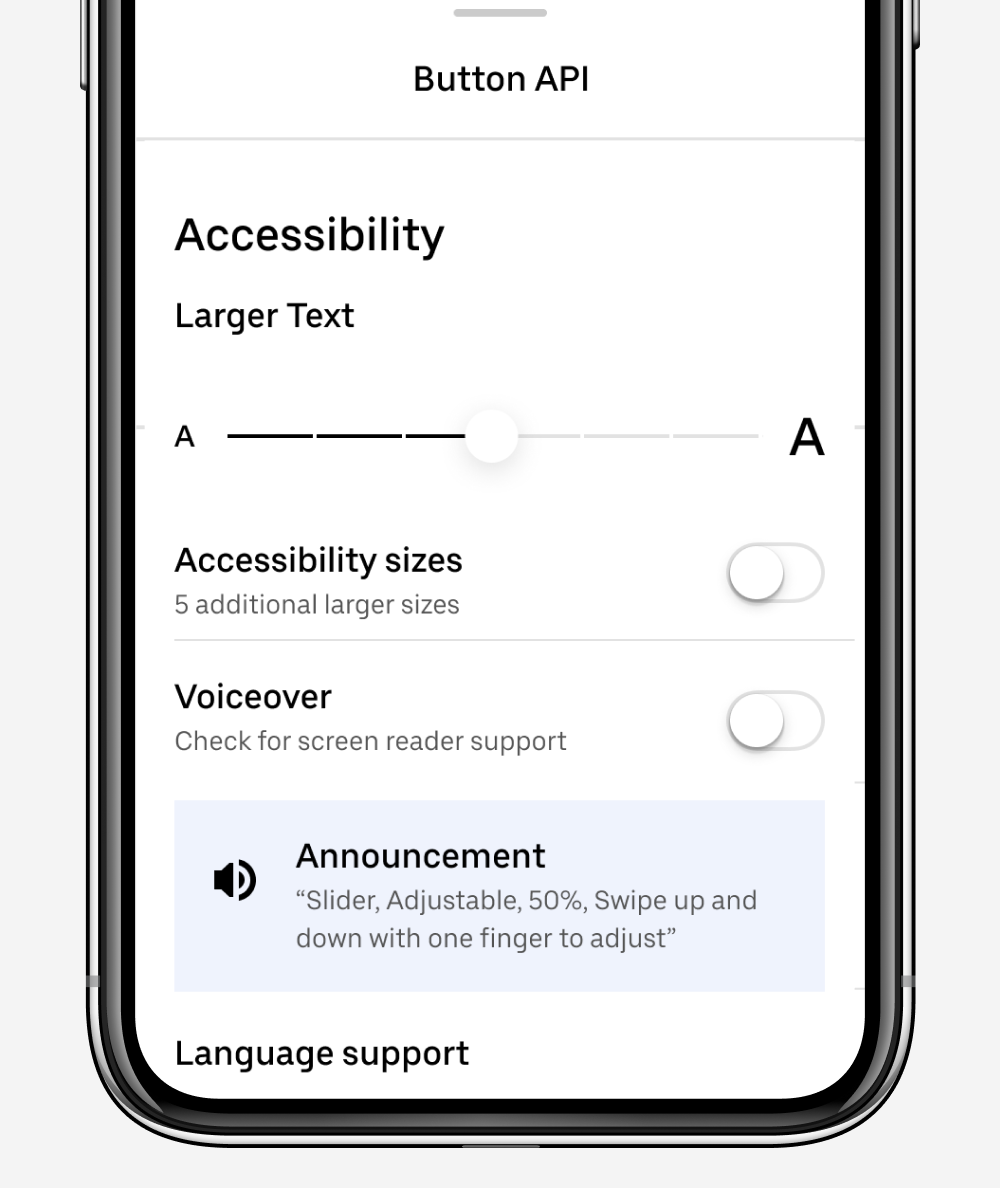
Accessibility Testing
In our Styleguide app, we built an Accessibility testing tool that allowed us to test each component in different sizes, enunciate Voice Over/TalkBack, and test it in 5 different languages.
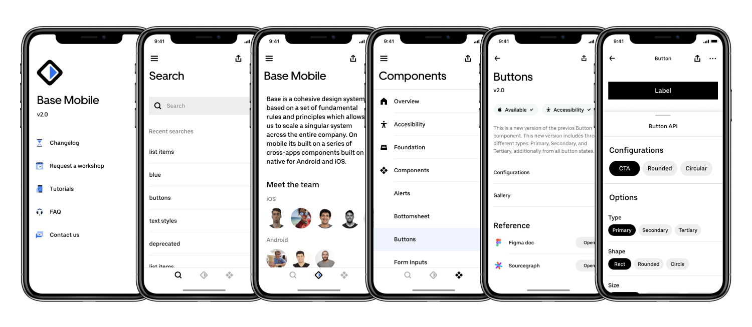
The real Source-Of-Truth
Working on a daily basis with my team of engineers, we put together this native app for iOS and Android where someone could learn more about the team, team members, status of each component, references, and more importantly play with each components’ configurations and presets like type, size, shape, status, test long strings, languages, and accessibility features. All in one place. We used this also as a sales tool to show all the benefits from using Base components, and increase adoption of the Design System.
Examples of component configurations

Button

Listview

Slider control

Checkmarks
Color Semantics
I built a new Color Tokens & Semantics architecture from the ground up to scale to all Uber products including Rider, Driver, Eats, Freight, Jump, and more. This new architecture also opened the door to support light and dark mode on all apps. These are the top level categories, not including component specific ones.
